Check your target- a case study
I recently worked on a project with a client who was very excited to get his venture off the ground. He had an exciting product, proven success, and drive to get more work done. It was exciting to get started with him, but I found that he was, perhaps, aiming at the wrong target user. Working on this product, AnySpace, was good for all parties involved, but not without it’s challenges.
What is the problem anyway?
Contracted through DESIGNATION, my team and I started this process with an initial meeting with our client. He was excited, passionate, and knowledgeable. It was a dream come true. In my time at DESIGNATION, I’d heard horror stories of people working with clients who were phoning it in, or confused about what they actually wanted their product to be. I dodged a bullet with my owner/CEO who knew the ins and outs of his product intimately.
His product is a room reservation system that makes finding a room for a meeting or social event dead simple. He knew a lot about this from his time in school, planning with his MBA cohort. He presented us the challenge of redesigning how users on the renter side (vs the venue side) requested proposals and researched venues.
He knew from his own testing that there was confusion around the names of different sections on his site. Landing on the page, users were presented the options of “Search” and “Marketplace” and nobody knew what either of those meant. As designers, we had clear direction and a clear problem.
Is anyone else even doing this?
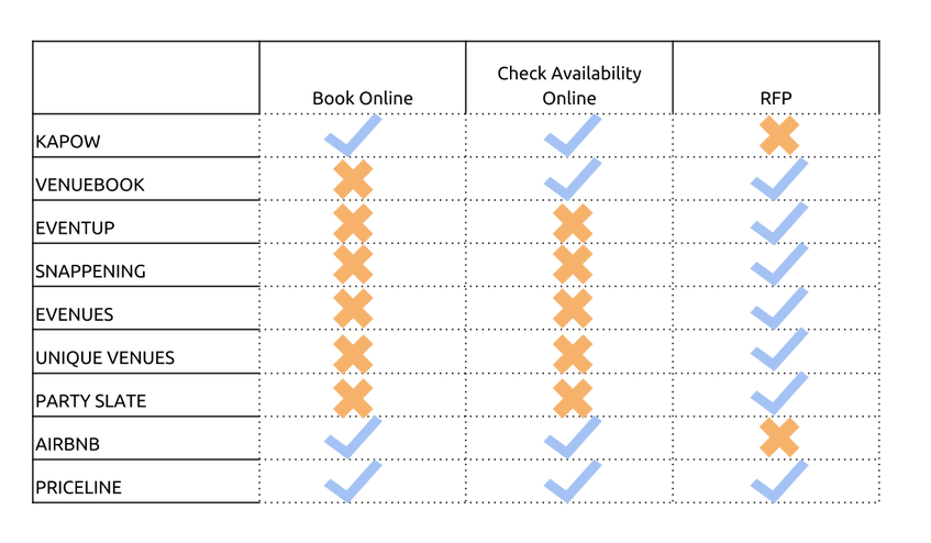
My team and I knew that we needed to start out by researching the market and seeing what competitors were out there and how they were solving this same problem. What we found we put into a competitive analysis to get a grasp on the landscape.
We noticed immediately that no one service was offering exactly what AnySpace was planning on offering in its final iteration.
Two competitors we spent the most time with were Kapow and Airbnb. Both of these sites offered useful, smart feature sets that were making the process of booking a space simpler and more enjoyable.
Airbnb succeeded in showing the user only the places that were applicable to your guidelines. They made booking a private home as simple and consistent as booking a hotel room.
Kapow was the current available offering that most directly competed with AnySpace. They built their booking service around packages. This served to homogenize the search and booking process in a marketplace usually based around customization.
To make this even more clear, I put together this graphic showing features and strengths of competitors.
We got a pretty clear picture of the marketplace that AnySpace was entering. I knew that we had a path starting to develop and just needed to flesh out our ideas by talking to real people. It was time to develop our line of questioning and validate some assumptions.
Talking to bookers
Looking for potential users for AnySpace, we soon realized that… there weren’t many. We took this in stride and sifted this data and drew some conclusions. From our client, we were able to speak with a handful of potential users who booked corporate events at hotels and high end restaurants. These users almost exclusively booked with people and places they had a relationship with. When asked about a service like AnySpace, they responded positively, but were definitely going to complete the booking either in-person or over the phone.
At this point, we felt stymied. We made a few phone calls and broadened our user base. We spoke with more users who talked booking more casually. The universally complained that it took forever for restaurants to get back to them and the prices were usually way out of their price range. They did, however, mention that if AnySpace created a marketplace for small mom and pop party rooms, they would book much more often.
This insight struck us as very interesting. I felt strongly that there was already enough competition and personal preference to make corporate bookings untenable for AnySpace. However, it seemed to me that there was a definite need for a product that could facilitate bookings for smaller, less frequently booked rooms.
This idea was important enough to warrant a double point.
Putting our shiny new insights to work
This project had us on a tight timeframe. For our purposes, we didn’t feel it was our best use of time to make full-fledged persona artifacts. We created two potential primary users, calling them:
The Social Booker
And, The Executive Assistant
I used these proto-personas, and what we’d gathered from our interviewees to put together a series of graphs that showed effort and communication levels over time. This didn’t take much time to put together, but it had a big impact on our client’s understanding of his place in the market.
The Social Booker
- Extroverted and Sociable
- Plans events for personal or small organizations.
- Event booking process lacks transparency
- Searching for variety of venues is a pain
And, The Executive Assistant
- Hardworking and ambitious
- Books corporate events
- Frustrated not having time to book events online
- Feels the event booking process is all scattered and unorganized
I used these proto-personas, and what we’d gathered from our interviewees to put together a series of graphs that showed effort and communication levels over time. This didn’t take much time to put together, but it had a big impact on our client’s understanding of his place in the market.
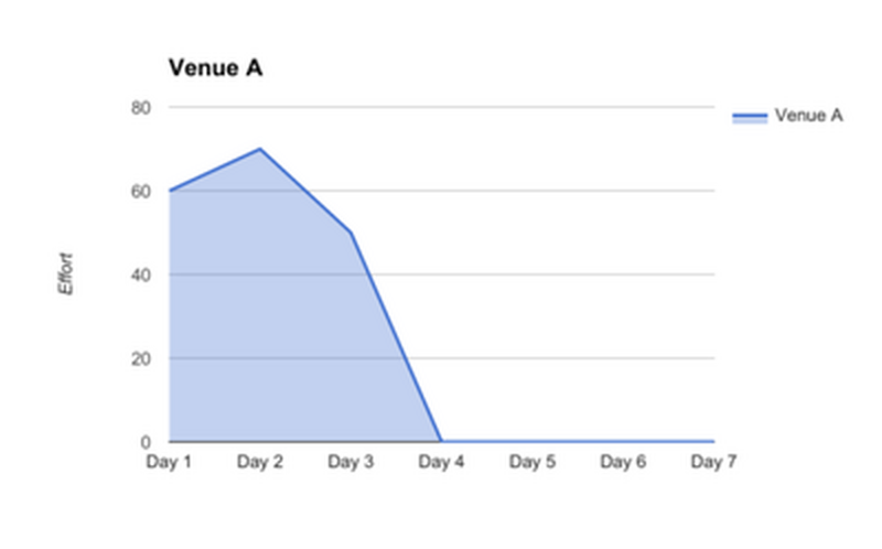
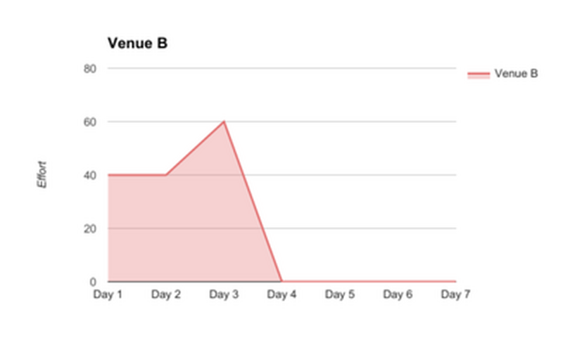
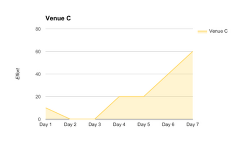
Some simple visualizations of current communication and effort relationships.
These proto-personas were enough for us to put together a problem statement to solve for and a set of design principles to help guide us. We knew that we were solving for:
Tech savvy, but infrequent event planners need a transparent, centralized system to make the venue decision making and booking process more streamlined, and tailored.
And some guidelines to help us in the process were:
Speed is Key
Cut the Fat
Flexible and Adaptable
Tech savvy, but infrequent event planners need a transparent, centralized system to make the venue decision making and booking process more streamlined, and tailored.
And some guidelines to help us in the process were:
Speed is Key
- Design a system that reduces the amount of time the booking process takes by providing all the information needed to make an informed decision readily available.
Cut the Fat
- Make sure that at each step of the booking process there are no unnecessary steps or extra information that might disrupt the user from accomplishing their goal.
Flexible and Adaptable
- Each user is different and has different needs for their events. We will design a system that can be tailored for each user and event so that it is focused on their particular details and requirements to book a venue.
Ideation: Out of my head and onto paper
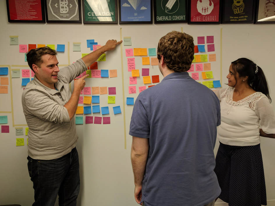
Our client was onboard with our ideas and excited to see what we came up with. We began our process of ideating around what we knew. I’m a fan of 6-8 Fives and recommended that as a way to kick off our process.
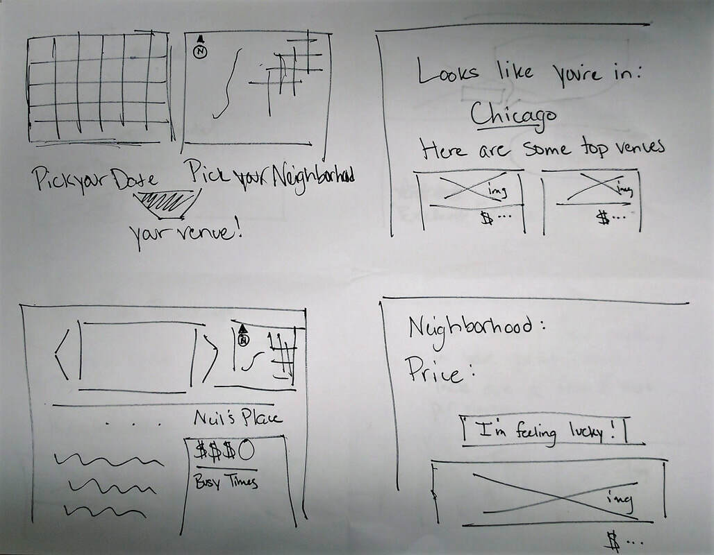
Some of my quick sketches, trying to imagine a new way to book venues
At this point, we split up as a team to flesh out our own individual concepts. We had the same body of knowledge, but wanted to bring as many diverse ideas as possible to the table.
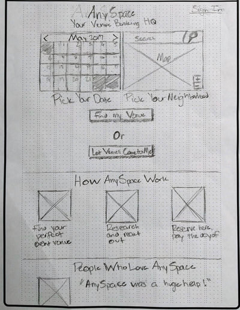
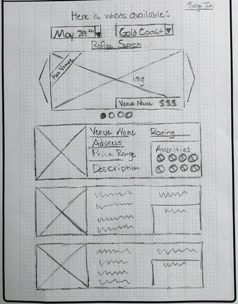
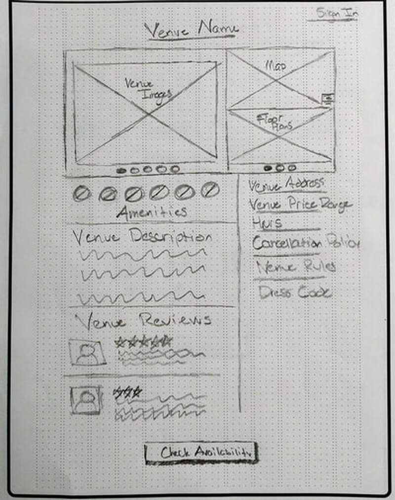
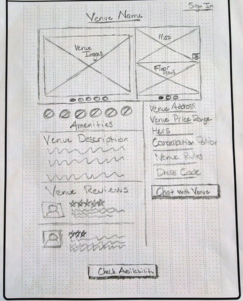
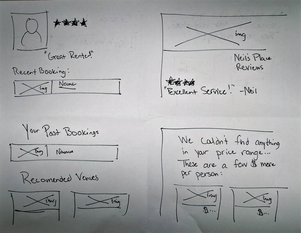
More paper sketches before beginning digital wireframes
This process was very helpful to me as a designer. Going into this phase of our project with the intent of diverging as broadly as possible, helped me come up with some more more intriguing ideas than I might have otherwise. I thought about using iconography much more throughout the process. I knew that this was a tried and true means of helping users engage, but it was an interesting challenge incorporating iconography more liberally in a flow that had none in it previously.
We tested these divergent concepts with users and were very pleased with the feedback. The tweaks we’d made to the overall flow, and the language we’d used to describe them worked well. Users had a much clearer idea about what they were able to do with the service and why they’d want to use it.
We tested these divergent concepts with users and were very pleased with the feedback. The tweaks we’d made to the overall flow, and the language we’d used to describe them worked well. Users had a much clearer idea about what they were able to do with the service and why they’d want to use it.
Putting it all together
Again, due to our time constraints, we now had to jump right into a converged, interactive, digital prototype. Using Axure, we all split up our key screens and got to work. We were able to agree on a design language we wanted to use for the prototype and create a consistent final product. It wasn’t without issue, but we were definitely able to put our best ideas together.
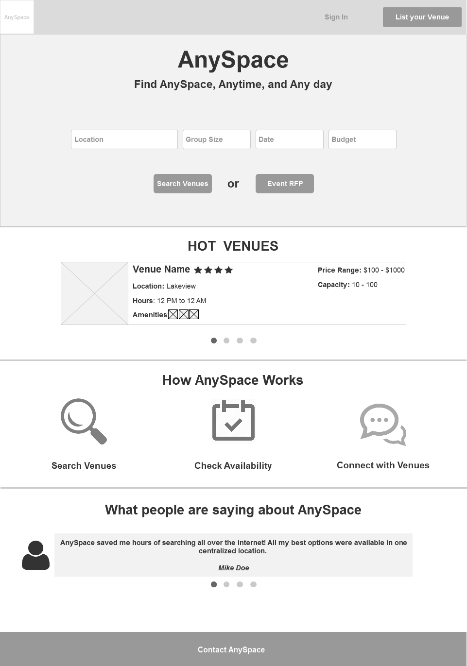
A reimagined homescreen for AnySpace. This layout puts the focus on what AnySpace can do for the user and simplifies the process or either searching for venues or requesting a price quote from the venue directly.
A link to this prototype is here.
Testing these ideas, we gathered very positive feedback. Users enjoyed the simplicity and speed of the venue search process. Conversely, they appreciated the level of detail and thoroughness of the RFP process. We had successfully solved for our problem statement, while aligning to our design principles.
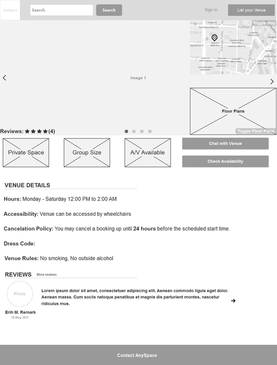
Our client was on board with our prototype and testing process. He fully supported our findings and wanted to implement some of them ASAP. The only stumbling block was, perhaps, that we hadn’t taken his business limitations in mind throughout. We may have designed some that was too blue sky. For instance, a well tested function was out “Chat with Venue” button. Ideally, it’s an asynchronous, proprietary chat that encourages the booker and the venue to chat in AnySpace rather than over the phone. Users liked this, but our client doesn’t see that happening any time soon. We’ll chalk this up to future functionality then.
The future of AnySpace
There are things we would like to incorporate into the project given unlimited time and money, namely the ability to directly communicate with a venue. I also think that the true potential of this product lies with hole-in-the-wall bars, rather than with restaurants and hotels. There is an untapped market there, but it would require a commitment and pivot of the whole product.
This was an excellent project to dig deeper into my UX toolbag. I liked finding new ideas to present information to a client rather than just the raw data. This was also the first time where I spent time and energy trying to convince a client that a pivot might help the business grow and flourish. All good experiences.
This was an excellent project to dig deeper into my UX toolbag. I liked finding new ideas to present information to a client rather than just the raw data. This was also the first time where I spent time and energy trying to convince a client that a pivot might help the business grow and flourish. All good experiences.
