Talking to your teen- a case study
Historically, it’s common knowledge that talking to your teenage child is an exercise in futility. Talking with a teen about what they’re learning in school is, logically, an even tougher challenge. Knowing this, I was excited to receive the challenge of improving and simplifying this herculean effort as my first UX challenge.
In this instance,we explored this challenge in a controlled, scholarly environment. Our working brief asked us to create a digital experience that helped parents and their children communicate effectively about school. We wanted to make sure we hit the ground running and ran into our first hurdle almost immediately: we were all too old.
In this instance,we explored this challenge in a controlled, scholarly environment. Our working brief asked us to create a digital experience that helped parents and their children communicate effectively about school. We wanted to make sure we hit the ground running and ran into our first hurdle almost immediately: we were all too old.
Wrapping my head around the issue
Before I began solving the problem at hand, I knew I needed to understand it. As a team, we all did research into what products and services were currently being used in schools today. We found that most if not all of them were new to us. Within these first days, we worked on a deep dive into the competitive landscape to help us pull apart what tools users were currently using:
Our competitive analysis of the current landscape. A document that changed and evolved as we learned.
We used this document to track functionality across platforms.
We, as a team, put together a competitive analysis looking at key features and and functionalities available. Discovering what competitors were doing, the good and the bad, helped us to get a true north for the problem we wanted to solve, how we were going to solve it, and who we were solving for. One of the many benefits of this analysis was that it grew and changed over the course of the project. We added and removed competitors as we interviewed users.
A few standouts included:

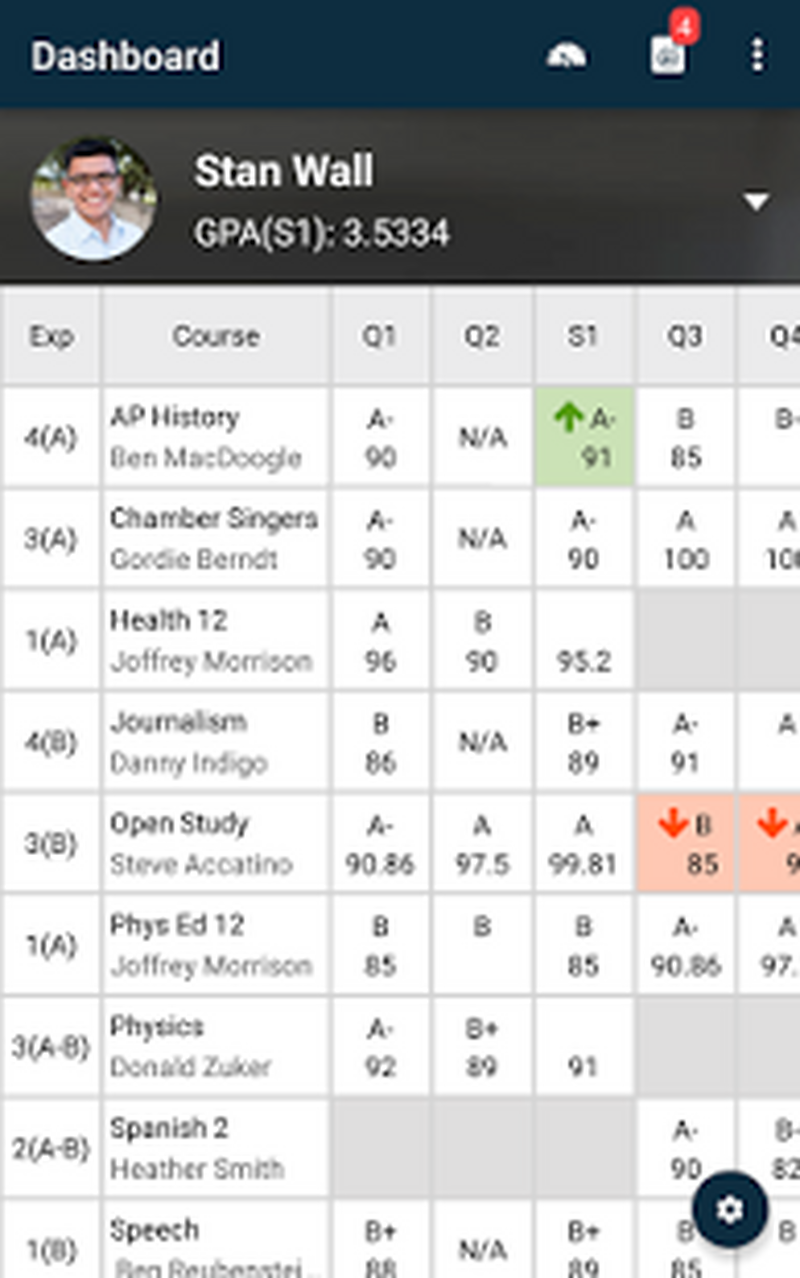
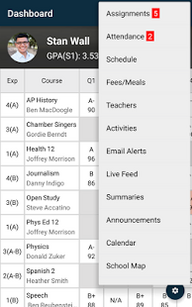
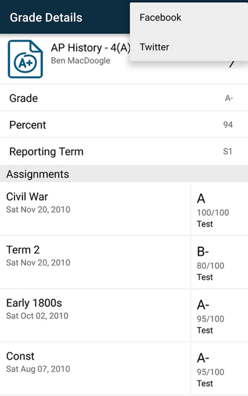
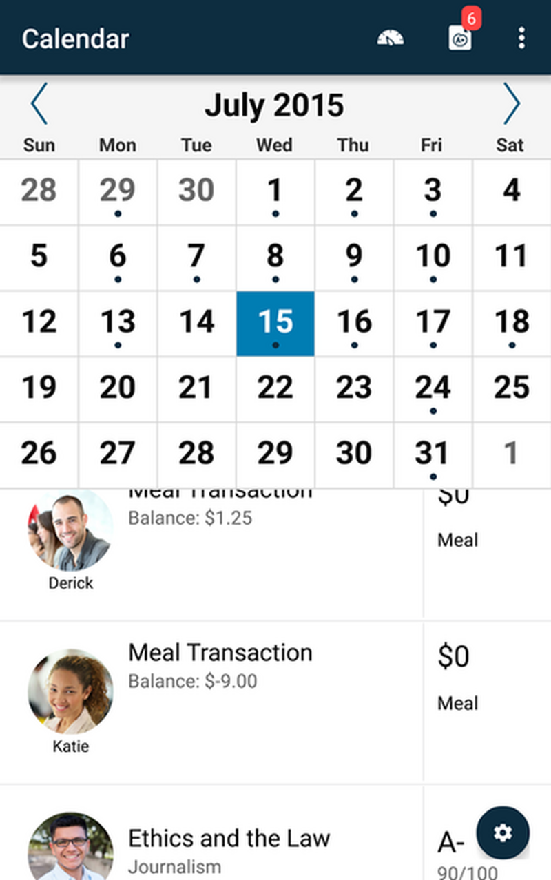
PowerSchool is a major player in the market. Powerschool is a powerful tool that schools use to make grading easier and to keep track of curriculums and attendance. This information is critical for schools to maintain and for parents to keep an eye on. However, we found this wasn’t helpful to parents for starting substantive conversations with their children.
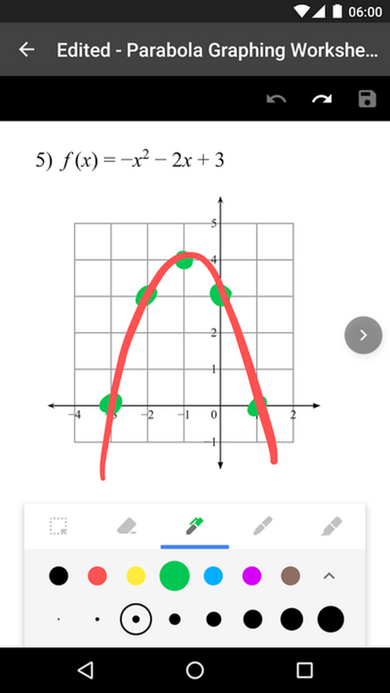
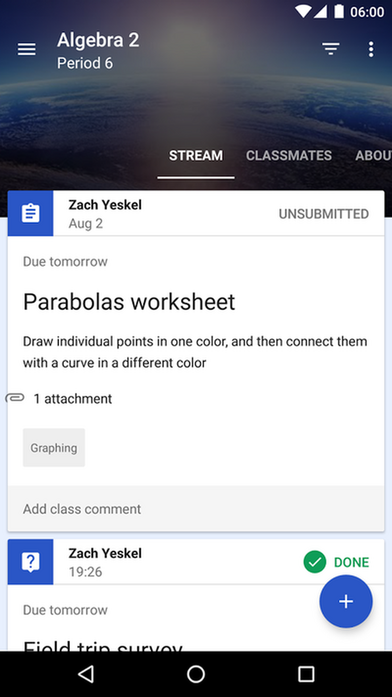
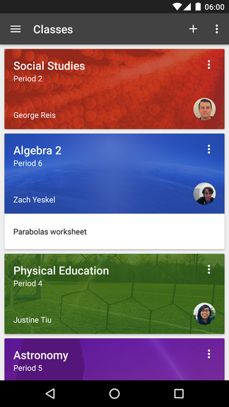
Google Classroom provides a great way for teachers to put together lesson plans and share assignments with students. This product was particularly interesting as it brings the full Google ecosystem to bear on the problems of the modern classroom. This is a great service, but is focused predominantly on interaction between students and teachers.
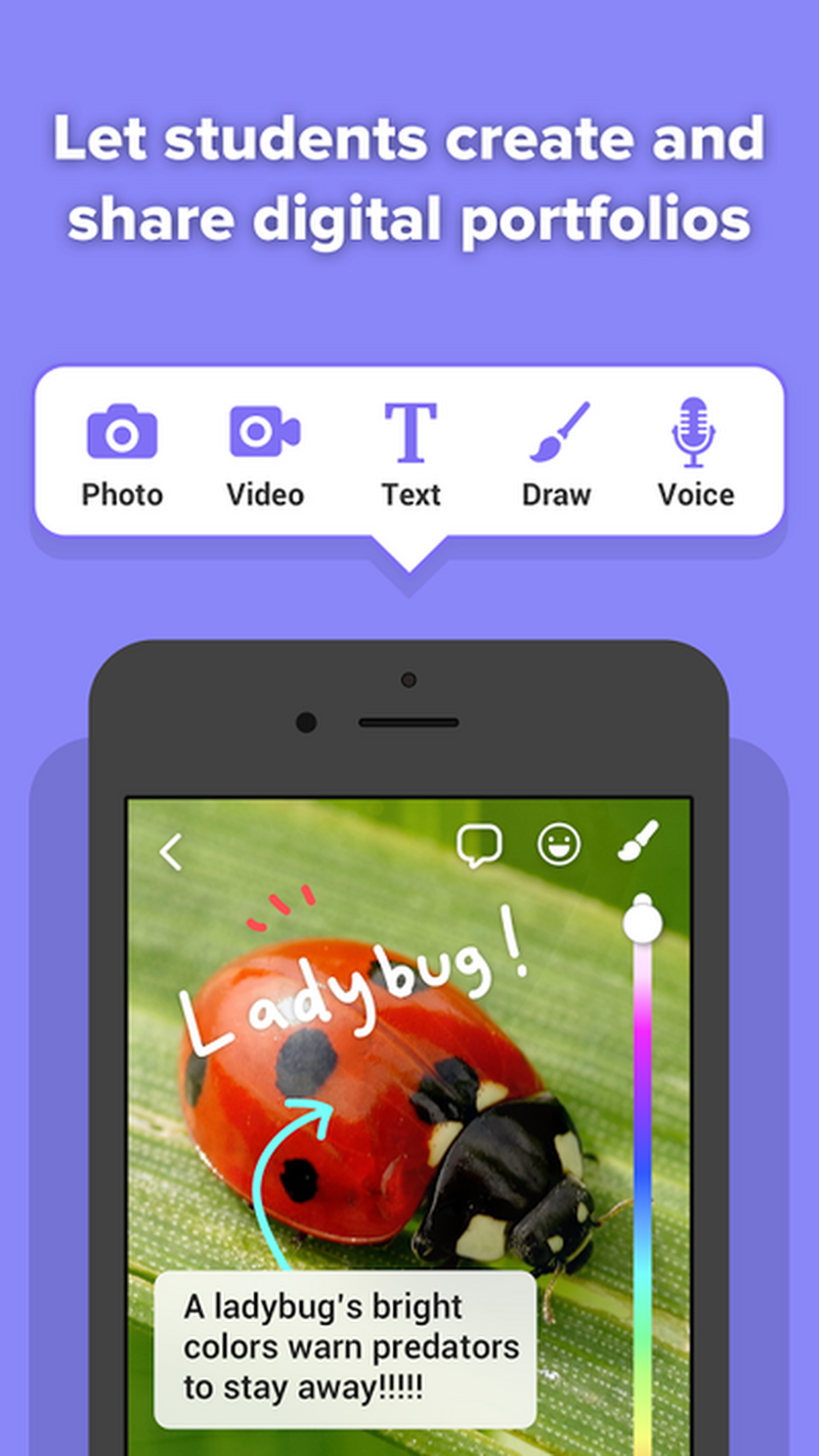
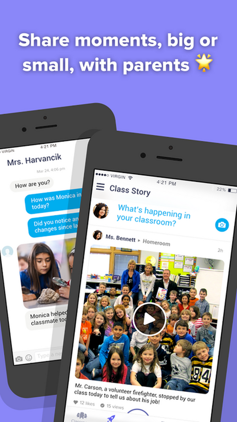
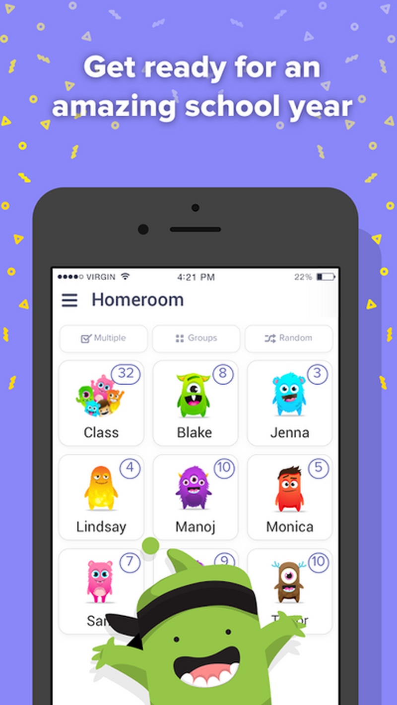
Class Dojo is a very interesting product that does a great job of keeping parent abreast of what’s going on in the classroom. A few things that we noticed when looking into the service was that it leans towards a younger audience. It also focuses mostly on what has come and gone; it has positioned itself as a great way for teachers to let parents know what is going on, rather than as a way for parents and students to talk about their education.
What we found over the course of this analysis process was that the current competitors did not offer a way for a parents and their students to look at upcoming assignments; they focused on reviewing events, rathering than planning ahead. Some excellent products also focused too closely on the interaction between teacher and student. This process was concurrent with our user interviews and we felt we’d found our way in.
Talking to people who might actually use this thing
As helpful as this living document was, our project hinged on talking to users and find out from them what they needed to facilitate conversations.
The majority of our interviews happened remotely. We split roles between taking notes and running the interview itself.
A challenge for us was finding users in this realm to interview. I know very few teens or tweens. In fact, I found I knew no teens or tweens. We were able to easily find subject matter experts in the form of school administrators and teachers, but, per the scope of the project, these were not our primary users. We learned a lot about the world of education and what frustrated and encouraged school employees, but we had a tough time finding potential users.
Some insights from professionals in the field:
“I try not to dwell on grades. Because there’s always a kid that sticks out. I don't want them to think that’s the only measure. I want them to know that. I’m looking for upward progress.”
Kelly, teacher
“The parents aren’t necessarily looking at the Google login separately from the students. They should be going in it with them together to check the assignments.”
Christine, teacher
Luckily, one of my teammates turned out to be a treasure trove of potential primary users. She had an extended family that included many target-age teens and their parents. This was great for us as a team, but we needed to think about who would lead each interview. We wanted to make sure that we were removing bias from the interview process. We did this by making sure that no team member was interviewing anyone that was friend of family. In hindsight, this was great for me.
We soon found (in conjunction with our competitive research) that the current products used most focused on past events rather than current or upcoming events and assignments in a student’s curriculum. Parents we interviewed universally wanted to keep track of their child’s progress while avoiding hovering and nagging. Students wanted well-informed support of their schooling while still being trusted to get their work done in preparation for higher education. We put all these insights from users into a huge affinity diagram to find what patterns existed.
I found very quickly that I love running interviews and spending time in someone else’s shoes. I leapt at the chance to run any of the interviews--it was deeply satisfying to work with an outline that we’d built for these interviews, then digging deeper with an interviewee to find insights that might have been glossed over.
I found very quickly that I love running interviews and spending time in someone else’s shoes. I leapt at the chance to run any of the interviews--it was deeply satisfying to work with an outline that we’d built for these interviews, then digging deeper with an interviewee to find insights that might have been glossed over.
I’m probably standing too close to the diagram in this photo, but sometimes research requires sacrifice.
This was a great exercise in brainstorming and lively discussion. Looking at all of the information in one place was eye-opening. Patterns appeared and took shape as we added more sticky notes. While we went through the process of digesting this information we also actively discussed what we learned. We very quickly found out who we needed to design for and what we needed to solve for them.
Patterns and trends we noticed from the diagram:
- Most students thought their parents were heavily involved, but appreciated it
- Students wanted to be independent and ask parents for help only as a last resort
- Parents felt they needed to stay on top of their kids to get them to complete their work
- Parents were often overwhelmed because they didn’t have time to relearn the material their kids learned in school
Putting these insights into practice
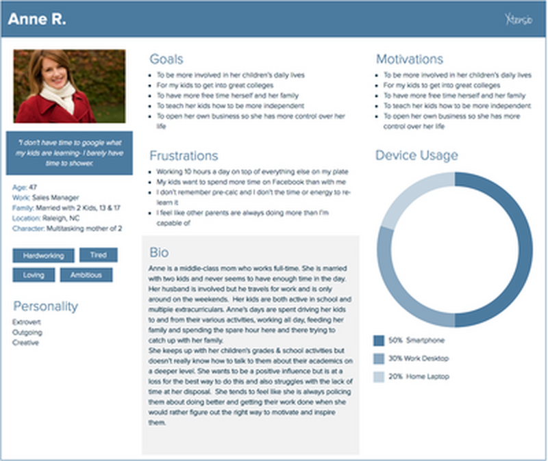
This is our parent persona. She’s busy as all get-out, and wants to help, she just doesn’t always know how.
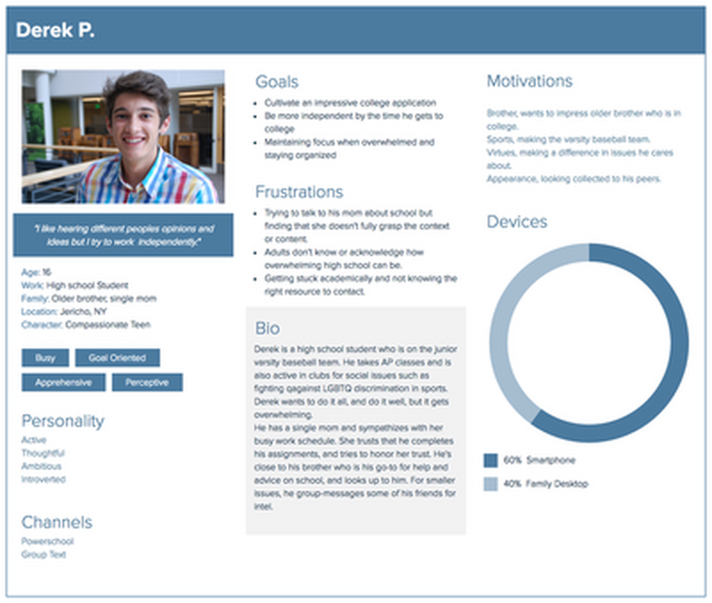
This is Derek, our student persona we developed to design for.
We knew who we wanted to solve for and it wasn’t who we’d previously imagined. The users we wanted to build for were by all accounts committed and engaged; they just needed direction. We knew there really wasn’t a way for us to design a product that would be useful to every teen student and every parent. We did feel confident that we could design a product to help self-motivated students get on the same page with their parents when talking about their education,
This journey map helped us wrap our heads around a day in the life of Derek.
We spent some time digging a little deeper into motivations. Building out our journey map started pointing us towards that brief window of time after school and before bed where parents and students had a few minutes to talk. We began the process of brainstorming ways to maximize this small timeframe to avoid the dreaded “school was fine” answers that students didn’t like giving and parents hated hearing.
With this Derek and Anne in mind, we confidently put together a problem statement to help guide us through the rest of our design process:
With this Derek and Anne in mind, we confidently put together a problem statement to help guide us through the rest of our design process:
Well-intentioned parents need guidance on how to more actively relate to their kids. They want to be engaged in their academic growth, but don’t know how much or what type of support their child needs. Making positive interactions easier will benefit both parents and students directly.
Giving ourselves some guidelines
We knew from our research that parental interactions with students is a good thing, but the people we interviewed (both parents and students) weren’t sure what form that interaction should take. Discussing and agreeing on design principles ensured that, even as we began working on different ideas to solve for our problem statement, we would all work from the same playbook.
Customizable and personalized
Advice should be appropriately timed; tuned to individual schools, students, and interests.
Effortless and efficient
Clean, simple, and easy to learn. Not another task a parent has to police, and child “has” to do.
Approachable but mature
Both parents and students will not be embarrassed about it. Fun to use, low time commitment.
At this point, we got into the nitty gritty process of ideating around this statement and drawing out rough prototypes of our individual team concepts.
My teammates focused on two ideas: building a concept on utilizing schoolwork in real world situations and looking at attaching simple emotional notes to school assignments. I decided to focus on giving parents and students a shared foundation for a conversation later in the day while giving conversation control to rotating participants. The idea was to also add some friendly competition to dinner conversation.
My teammates’ projects: RealClass and SeeDo
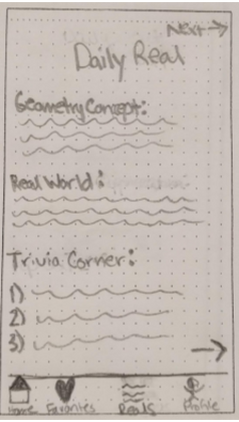
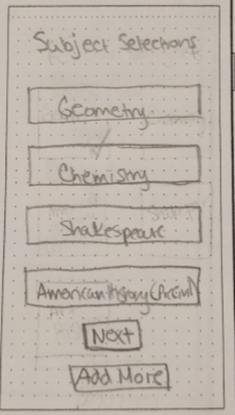
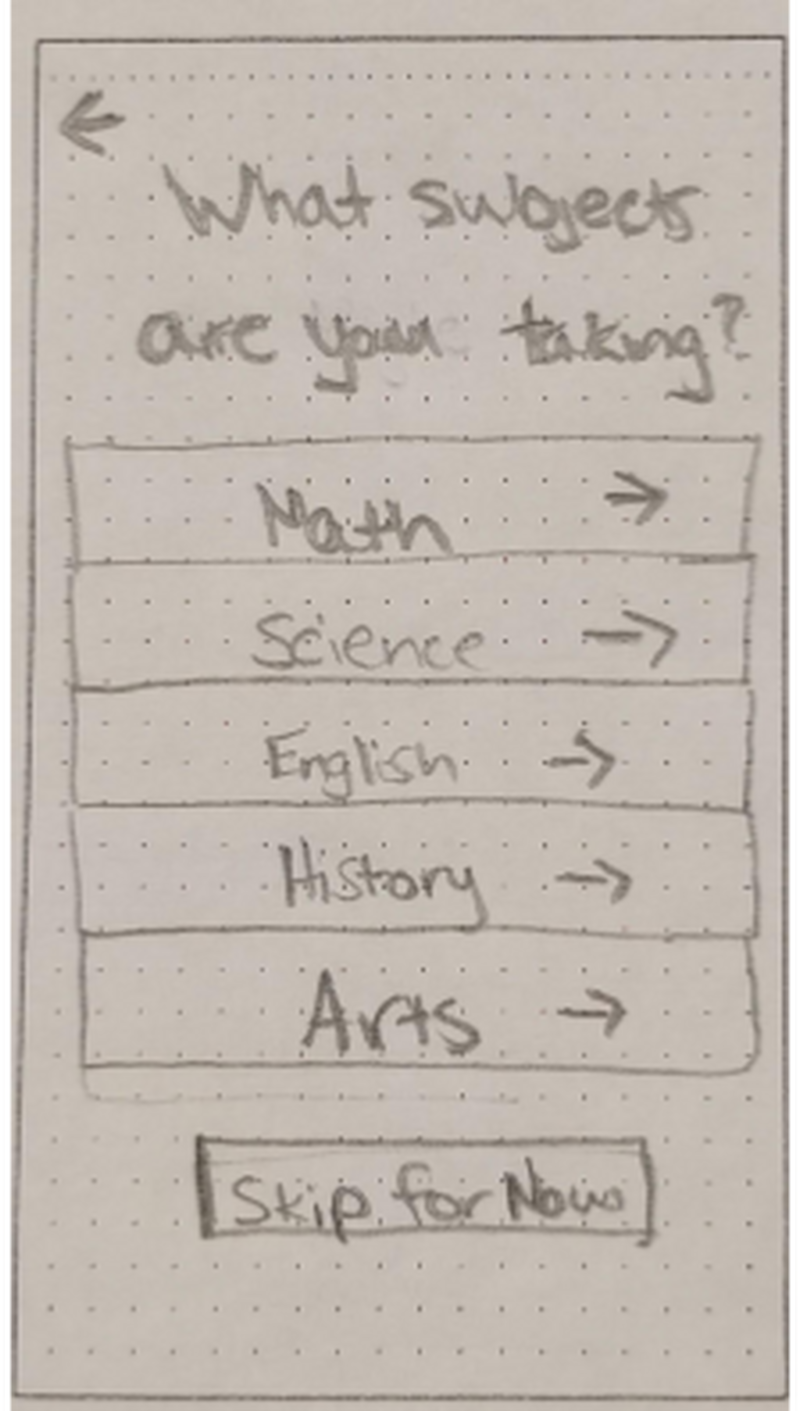
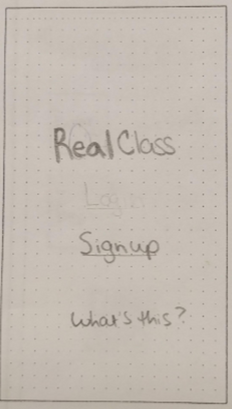
RealClass focused on adding context to what students are working on.

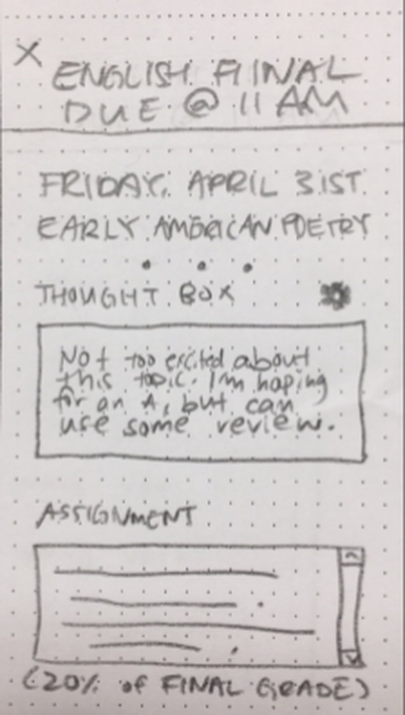
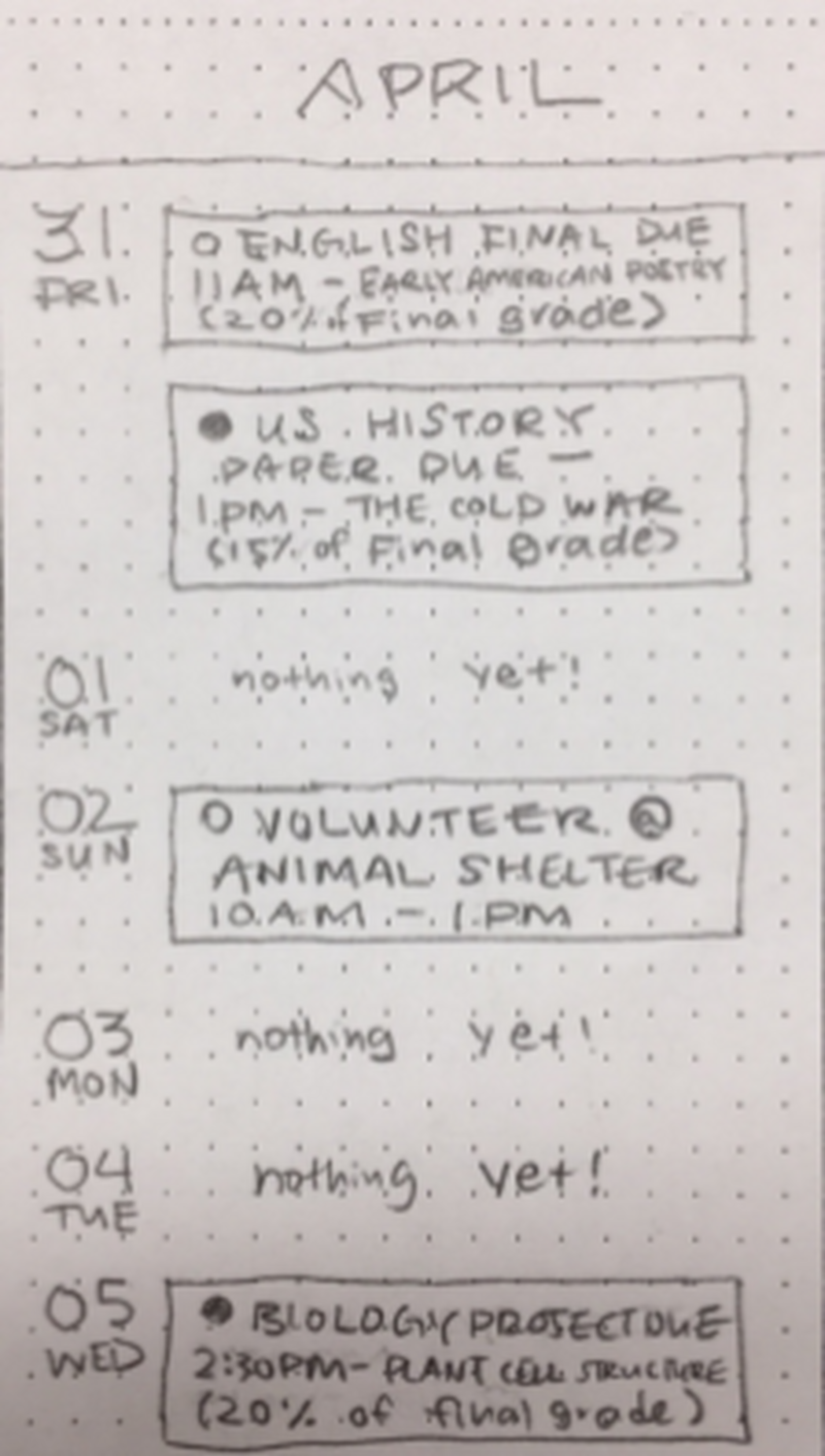
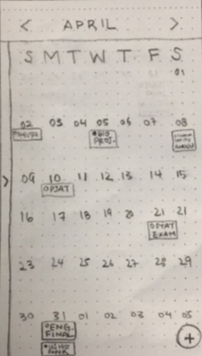
SeeDo gave a forward looking, calendar based view of the curriculum.
My paper prototype: DinnerDriver
Admittedly, I might have enjoyed building this paper prototype too much.
Figuring what key screens in this prototype were the most important was an unexpected challenge, but one that helped me grow as a designer. These screens broke out some of the most important things that I thought DinnerDriver could offer. In the first screen here, a user could start the process of selecting a topic of conversation for dinner at the next dinner event. The second screen above shows the post-dinner screen. The aspect of incentivizing good conversations starts here. Finally, these dinner point can be cashed out for pre-determined prizes for the student.
Over the course of four days, I refined and iterated this paper prototype as we tested. This idea of incentivizing active dinner conversation is one that still intrigues me after the fact. Spoiler alert: it didn’t test very well with users, but I think there is still potential for this idea to live on in some fashion. The users we talked to generally really liked the concept of this system for managing small, intra-family incentives and the playful nature of the app. The issue that would keep them from using it regularly was just the idea of an app “telling me what to talk about with my family.” This was a tough obstacle to get over and was a good exercise in messaging; I think I can still refine the delivery of this concept and remove the big brother-type feeling of app-assisted conversations.
We decided as a team that no matter how much users like something it’s secondary to how functional and helpful the tool might be. We went through the process of building out wireframes and lo-fi prototypes of each divergent concept to see how they all stacked up.
A labor of love for DinnerDriver that helped me refine skills in Axure.
And still my concept didn’t score as well among users when asked about how often they would actually use this app. Most people we talked to noted that the idea of using an app to help them or encourage them to have dinner conversations was off-putting. My teammates’ ideas were more accessible and immediately useful compared to DinnerDriver and we decided that. DinnerDriver was going to a farm upstate.
Time to put it all together
At this point, we began the process of culling features that didn’t fit or test well, and assembling ideas that worked well into one cohesive, testable prototype. We pored over our testing notes from our divergent concepts and made some tough calls on the exact direction we wanted to go. Luckily, we had clear direction from our users about what they needed in the product, compared to what they simply wanted. At the end of this deliberation process, we had Tally.
We found that to answer our problem statement, Tally had to do a few things well. We needed to make a product that helped give parents a forward-looking view on what their students will do rather than just reactions to what they’d already finished. We also discovered that education changed so much that parents needed to be reminded of concepts and informed about how certain concepts are taught in schools today.
As a team, we think Tally does this well. It tested well with users who thought that knowing not only the assignment but the underlying concept of that assignment as well made their interactions more fruitful with their children. We felt we created something to help eliminate the question “How was school today?” and it’s traditional monosyllabic answer: “Fine.”
Tally combined the best of all three concepts we tested and stayed true to our initial concepts. Tally included:
- Forward-looking agenda functionality, rather than strictly backwards-facing record-keeping
- Concise emotion journaling to keep parents abreast of what they’re child is feeling
- Real-world context around school subjects for all users
- Friendly competition to keep users engaged on a daily basis
A look at past thoughts that a student user wrote and attached to assignments they worked on in class.
The detailed view of an assignment and the interface for students to write thoughts and parents to read them.
A link to the entire prototype is here
We think that Derek and Anne would both enjoy using this app; making it easier for them to connect with their respective parent and child. Going back to our brief, I think this product served as a way to make communication easier without making it feel like a chore. Through testing and rapid iteration we found a point with Tally that makes it a useful resource for both parties while not making either feel like they’re being condescended to. Looking back on this project, that might have been the single biggest challenge we worked through.
Tally is done for now. I’m pleased to say that it was selected for use by DESIGNATION for a future team of UI designers to create the visual design for Tally. I’ll update this case study with some mock-ups of a more finalized product when they become available.
Some functionality that can improve Tally in the future:
I learned about UX design, user feedback, and teamwork from the process of developing divergent concepts. I also feel like I gave real thought to the business side of designing Tally.I learned there’s nothing more important than a user’s feedback in a project. As charming or cool or shiny as a prototype is, if a user doesn’t think they’ll use it, than it’s a non-starter. That single fact has stuck with me since this project and it continues to inform design decisions I make today. I’m proud of what we were able to do in a short amount of time.
We think that Derek and Anne would both enjoy using this app; making it easier for them to connect with their respective parent and child. Going back to our brief, I think this product served as a way to make communication easier without making it feel like a chore. Through testing and rapid iteration we found a point with Tally that makes it a useful resource for both parties while not making either feel like they’re being condescended to. Looking back on this project, that might have been the single biggest challenge we worked through.
Tally is done for now. I’m pleased to say that it was selected for use by DESIGNATION for a future team of UI designers to create the visual design for Tally. I’ll update this case study with some mock-ups of a more finalized product when they become available.
Some functionality that can improve Tally in the future:
- Allow parents to comment on student’s thoughts, past and current
- Add incentives for pop quizzes, and create an environment for friendly competition at home
- Consider ways for a more seamless integration between DailyPops and calendar
I learned about UX design, user feedback, and teamwork from the process of developing divergent concepts. I also feel like I gave real thought to the business side of designing Tally.I learned there’s nothing more important than a user’s feedback in a project. As charming or cool or shiny as a prototype is, if a user doesn’t think they’ll use it, than it’s a non-starter. That single fact has stuck with me since this project and it continues to inform design decisions I make today. I’m proud of what we were able to do in a short amount of time.


